On Sian's suggestion, I have been rethinking my composition for the PAP design, trying to create a little more interest and not be constrained by my thoughts on "how difficult will that be to felt?".
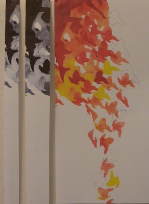
I've largely been cropping the image and repeating and settled on this:
 I liked the asymmetrical positioning and the fact that the staggered repeats are different sizes. The coloured shapes will fall off the bottom of the work but the outside edges will not be straight. The bottom and right hand edge of the organza will echo the shapes in lace and cutwork, full of negative spaces to break it up. I have drawn a few outlines in pencil of the shapes where some of the negative shapes will be to suggest the that the felt shapes have slipped / fallen off the background.
The 2 thin profiles I think will be in greyscale and the coloured one in dark blues to light green.
After looking at this a while I thought about cutting through the profiles to give 3 strips joined by lacework or not at all. The lines seem to echo the dropping shapes.
I've largely been cropping the image and repeating and settled on this:

The 2 thin profiles I think will be in greyscale and the coloured one in dark blues to light green.
After looking at this a while I thought about cutting through the profiles to give 3 strips joined by lacework or not at all. The lines seem to echo the dropping shapes.

No comments:
Post a Comment